15 Best Web Safe Fonts
There might be a few more.
But these are the best 15 web safe fonts to choose from. Select one of these and you can’t go wrong.
1. Arial
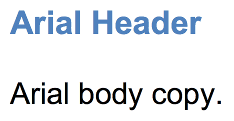
Arial is like the de facto standard for most.
It’s one of the most widely used sans-serif fonts (which means no little curls on the end of each letter). It’s often substituted on Windows devices for other interesting (read: more beautiful) font choices.
2. Helvetica
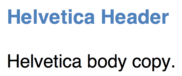
Helvetica is usually the designers’ go-to sans serif font. You can almost never go wrong with Helvetica (or at least using it as a fallback for most other choices).
3. Times New Roman
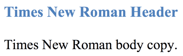
Times New Roman is to serif what Arial is to sans serif.
It’s among the most popular on Windows devices and is a new variation on the old Times font.
4. Times
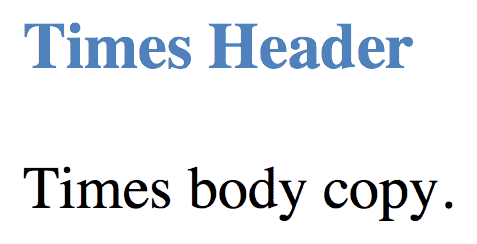
The Times font probably looks familiar. It’s the old newspaper print that you’re used to seeing in a small size in narrow columns. It’s about as traditional as it gets.
5. Courier New
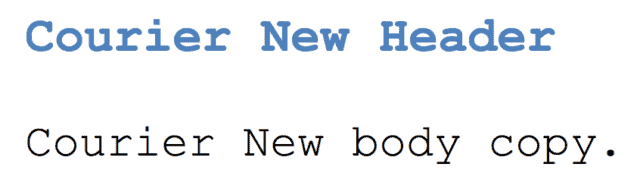
Courier New, similar to Times New Roman before it, is a variation of another old classic. It’s also considered a monospaced font (as opposed to the serif vs. sans serif we just saw).
6. Courier
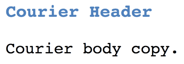
Courier is the old monospace stand-by available on almost all devices and operating systems.
7. Verdana
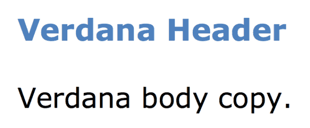
Verdana is a true web font because (1) the simple sans serif lines and (2) it’s super large size. The letters are almost elongated, which makes it easy to read online.
8. Georgia
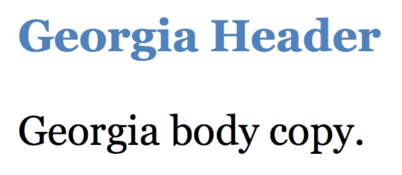
Georgia is similar to Verdana in size and stature (with bigger-than-usual letters compared with fonts of the same size). So while it’s great for certain circumstances, make sure to avoid pairing this serif font with others (like Times New Roman) which might look minuscule in comparison.
9. Palatino
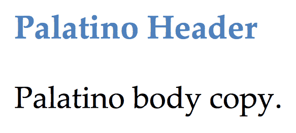
Palatino dates back to the Renaissance. Seriously! It’s another large font that makes it perfect for the web, traditionally used for headings and print-style ads.
10. Garamond
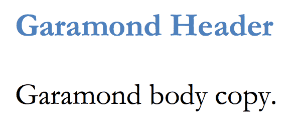
Garamond is another old-school font that dates back to styles used in 16th century Paris. This new and improved version was introduced and bundled on most Windows devices (and has been adopted by others since).
11. Bookman
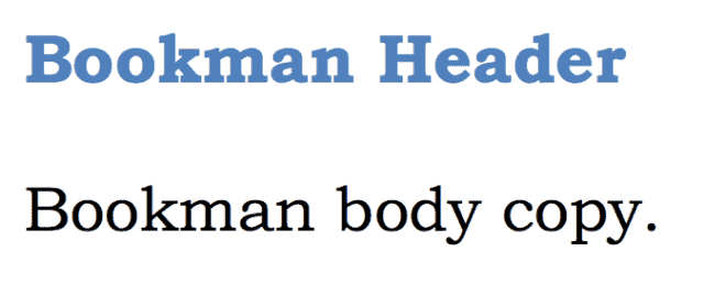
Bookman (or Bookman Old Style) is another perfect headline option that maintains legibility (or readability) even when used in a small size.
12. Comic Sans MS
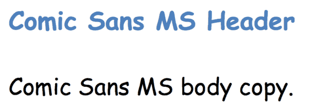
Comic Sans MS is a playful, whimsical alternative to other sans serif options.
It’s also kinda fugly. Don’t use it! 
13. Trebuchet MS
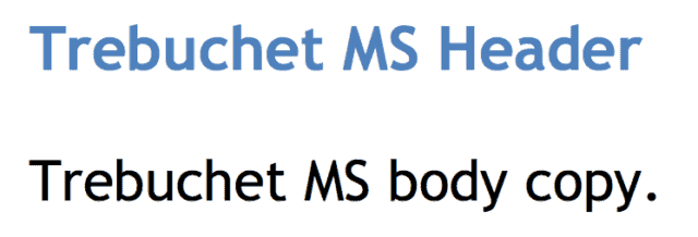
Trebuchet MS is a medieval-themed font originally designed by Microsoft in the mid-nineties. It was used on the XP version, and today commonly appears as body copy on the ‘net.
14. Arial Black
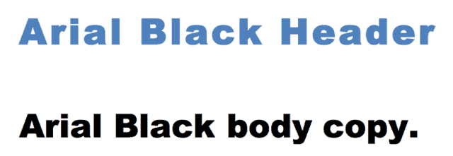
Arial Black is the bigger, bolder, badder version of your basic Arial. Funny enough, it also shares proportions with Helvetica. Why is that important? So that they could originally use it to replace Helvetica and print things without paying for the license.
15. Impact
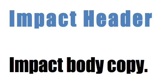
Impact is another bold headline choice that looks great in a few short words, and absolutely terrible in a sentence or longer.
Conclusion
Web-safe fonts give you a Plan B. A fallback option for when your first option might not work.
They’re widely accessible and have been available on most devices for decades (in some cases).
While not all of them are #winners (Comic Sans MS? Yuck!), there are enough to choose from that should be closely related to your original option.
What happens, when if not? You can’t go wrong with Helvetica!
 BLUE — Blue is often used to convey honesty and trust. Regarded as soothing and dependable, blue is approachable and known to relax web users. Many social media sites use blue, including Twitter, Facebook and LinkedIn. It is a pleasing color for a site that someone plans to be on for long periods of time.


The Importance of COLORS
Website color schemes have the ability to generate a positive impact on the visitors to your website or target audience of your brand. You want the user who visits your site to feel comfortable taking action and positive about your brand. Even if users don’t realize how important colors are, it is often a subconscious reaction.
Different colors symbolize and evoke different emotions. So when choosing the colors to represent your brand, it is important to decide exactly what your brand is trying to convey and who your target audience is.
For example:
BLUE — Blue is often used to convey honesty and trust. Regarded as soothing and dependable, blue is approachable and known to relax web users. Many social media sites use blue, including Twitter, Facebook and LinkedIn. It is a pleasing color for a site that someone plans to be on for long periods of time.
GREEN — Green is often used to convey healthy, safety, stability and freshness. Whole Foods is an example of a brand that uses green in their logo to convey a mix of freshness, health and nature.
RED — Red is often used for excitement and in high-energy situations. Red is also commonly used as a strong call to action color. (Stay tuned for tips on CTAs later in this post.) ESPN uses red for their logo to create excitement and energy.
YELLOW — Yellow is one of the brightest and most fun colors. It evokes a happy and cheerful demeanor and evokes creativity. It is often used in products that are targeting children. Snapchat used yellow in a positive way, seeking to attract a large, diverse crowd and give off a comfortable and fun feeling.
SILVER — Silver is often used to convey sophistication and class. Some of the most sophisticated and high-end brands use this clean and monotone color to represent them. One of the most notable is Apple, widely regarded as being an industry thought leader and representing exclusivity.
When choosing a color for your brand or website, it is important to think of your target audience not only in terms of what they are looking for, but also what they need. If your target audience is elderly, yellow can often strain the eyes and inhibit readability. It is recommended to use dark or black text in most instances to give contrast.
Your brand identity should consist of one of these colors that will be the main color representing your brand (Coca-Cola is represented by red; McDonald’s is represented by yellow). Once you have this color, choose four (max) additional colors to build your palette. There are various tools that can help you find colors that complement your primary color (for example, this Adobe Color Wheel).
No comments:
Post a Comment